


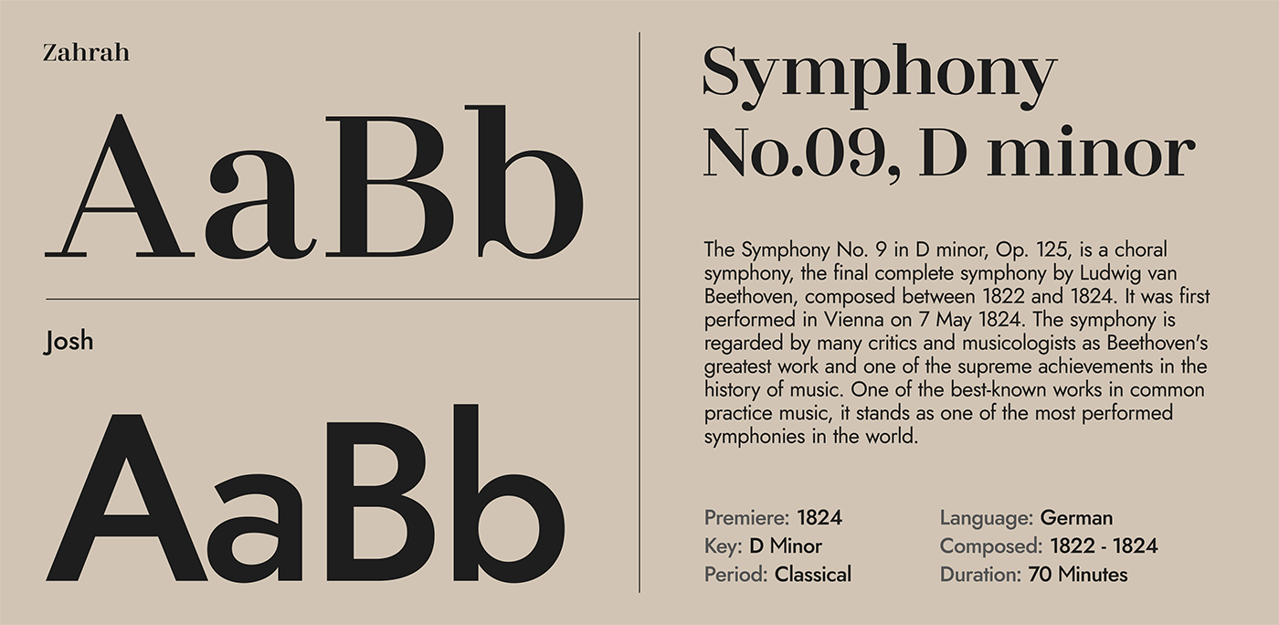
Concept
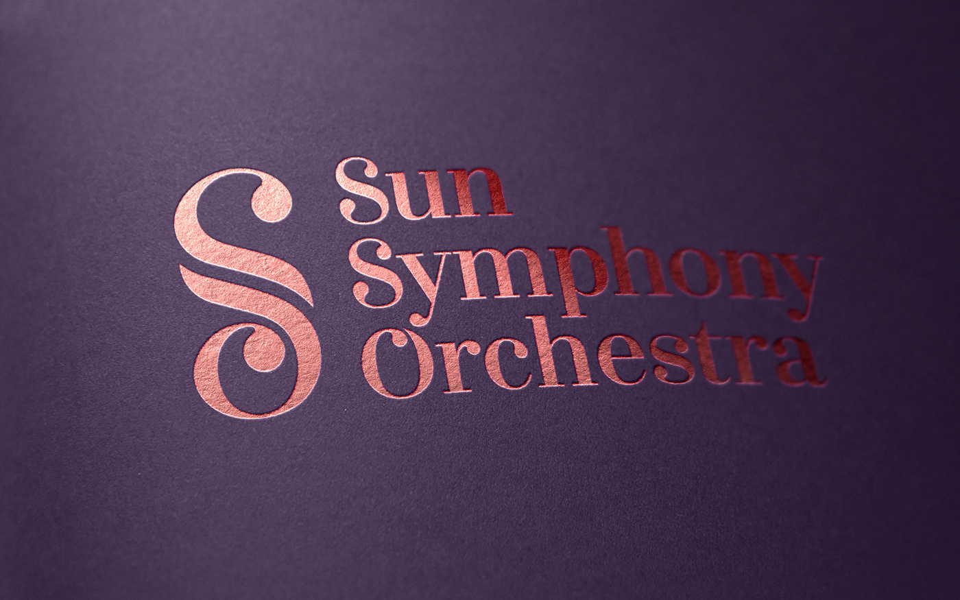
Inspired by the vision of the company and the orchestra, CAAY created the visual artifice in a minimal way yet still be polysemantic. The name of the company is used as a graphism that contains an interlink of Sun Symphony Orchestra’s initials and illustrates clef note - the beginning of every symphony. And on all publications, the vibration of music is delicately crafted to add dimensions into illustration, which is our aspiration to make the audience feel rhythm from just a look.
Colors scheme
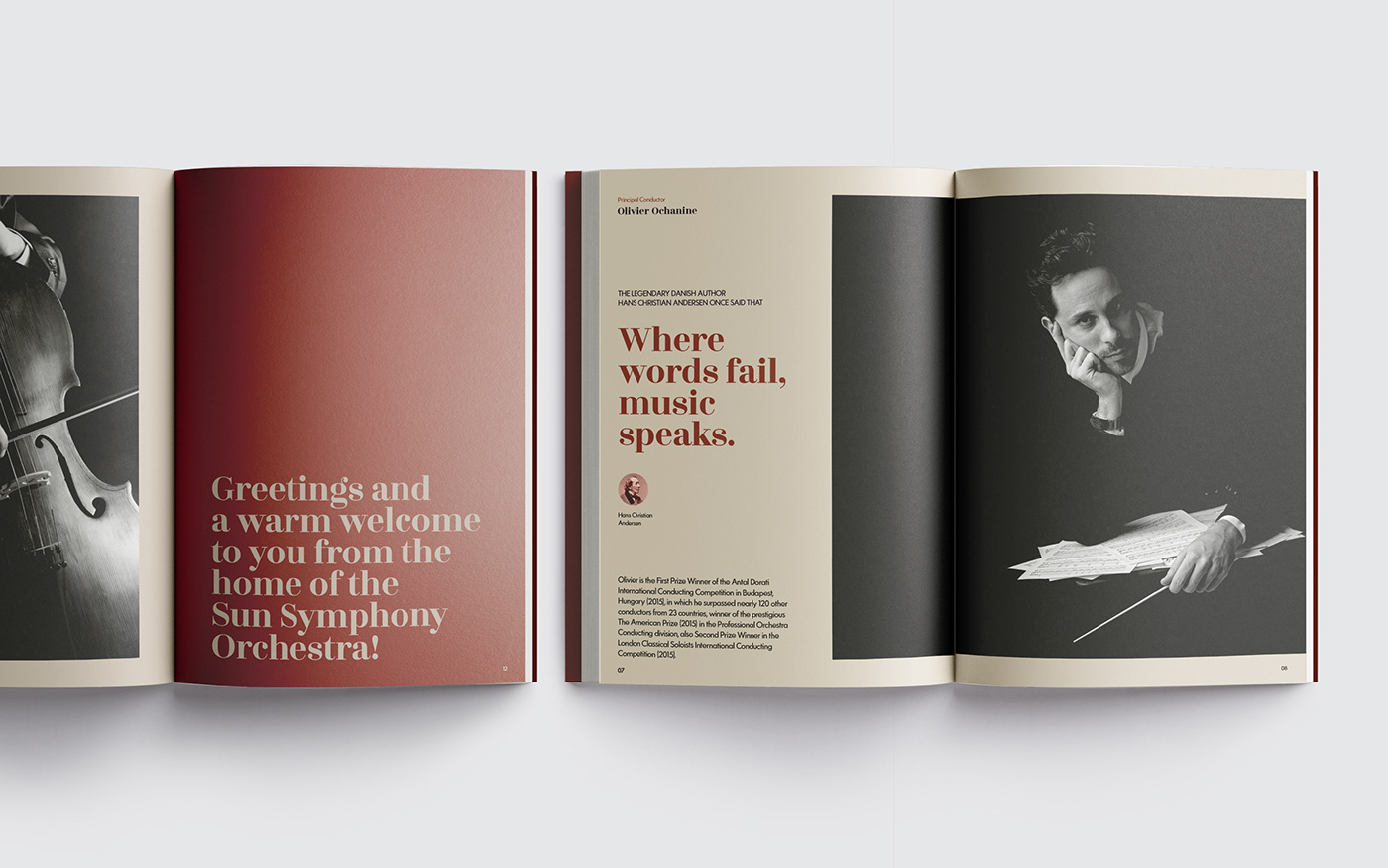
Throughout the past, people have linked color with their ordeals, excitement, expectations, pleasures as well as despair. The Sun Symphony Orchestra branding’s palette is created with multicolored language that reflects not just the sense of royalty, classic and elegance but the dynamic of the musical performance. The aesthetic element is now elevated to not only indulge the eyes but present stories - contributing to the harmony of the orchestra.


THANK YOU FOR WATCHING


